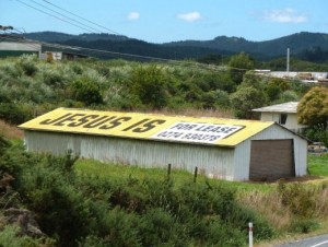
 Outdoor advertising has been around since ancient Egypt. You may think I'm kidding but it's true I swear.
Back then it was in the form of stone obelisks (whatever those are) to remind people of the laws and treaties.
Clearly it's been tweaked a little since we use paper and ink nowadays. But nonetheless it's old.
What is Outdoor Advertising
So what is outdoor advertising in 2014? Well the name itself pretty much says it all, it's any type of advertising that is outside. Also called "out of house" advertising, the two terms are synonymous, so if you want to sound really smart in advertising lingo, I've given you the key.
But this type of advertising is done through billboards, buses, taxis, train stations, basically anything that promotes a brand that is outside the home.
This type of advertising is a great way to reach your audience where they live and work. It's media that is everyone and unlike TV or radio ads it can't be turned off. Think about how much time you spend outside your home, we are a generation constantly on-the-go.
Outdoor advertising, such as billboard advertising, is also really cost-efficient. It's a great way for smaller businesses to spread their message and brand. You can place your message anywhere from a shopping cart to a park bench; the possibilities are endless.
Another awesome thing about outdoor advertising is that it allows companies to be creative. You control what your audience views. With technology you can create interactive ads that allow you to interact with your consumers. Unlike print ads you can create 3D ads that may (when used correctly) make people stop in awe.
Like anything there are guidelines for creating killer content for this type of advertising. The rules of outdoor advertising (in the words of Elle Woods) are simple and finite, any advertising guru would know. And if you don't it must be your lucky day because after reading this you'll know how to create effective outdoor advertising like a boss.
Don’ts of Outdoor Advertising
To be really blunt, there are some really horrible fails when using outdoor advertising. If you read Buzzfeed like me, you may have stumbled across an article or two on bad advertising placements, which usually make for a great laugh. If you don't your ads to be laughed at by millions across America (maybe even the world but that's kind of dramatic) here are some rules for what NOT to do.
Don't Cover With Too Much Content
Usually having a lot of content is a good thing but not for outdoor advertising. If you're filling your ads with a phone number, address, email stop right there. You have way too much content in your ad. I hate to break it to you but no one is whipping out their cellphone and calling you after passing by your ad. Focus more on your brand identity.
Don't Try to Be to Clever
This is really important. A boring ad is going to gain as much traction as a clever one. Don't try to make far-fetched puns in your outdoor ads. This type of advertising is for people on the move. If they don't get your point in about five to six seconds, it's going to be lost in translation kind of like the movie (sorry to those who enjoyed it). Try to make your ads smart and messages that click instantly for your audience.
Think About the Placement of Your Ad
The placement of your ad is crucial to the success of your advertising. But with that being said you can't be 100% sure what ads will be neighbors with yours. However there are some things you should consider when buying ad space. First actually look with your own eyes at the space you want to rent. You can hire an advertising agency to do the hard work for you but do your homework!!!
If it's a billboard is it in a good spot, will people zoom past it? Is there an outdoor ad directly next to it? Could this inter with the message your brand is trying to get across? There are so many outdoor ads that are an epic fail because of the ad above or below it (there's proof below) so just keep this in mind when trying to find space.
After weighing the pros and cons call the company who owns the space to see when it's available to be rented. If your product is more of a summer item but the only time the space is available is in the dead of winter, you might want to think about finding a new spot.
Outdoor Advertising Fails


Just to clarify, Starbucks most certainly does not suck. But who ever designed this van should have probably thought about what would happen when the door slides open. Now you're giving the Starbucks haters more of a reason to criticize for the 'overpriced beverages'. Photo Courtesy of Viral Nova
 This ad is a little riskay in the first place but then to put it on a bus? Buses get dirty, a lot. Mmm not fabulous, try epic failure. Photo Courtesy of Viral Nova.
 This is what I was talking about, check out the surroundings where your ad is going to be placed. I don't know what company has it worse. I would probably still go to McDonalds though after seeing it, soo... Photo Courtesy: Flickr
Do’s of Outdoor Advertising
There are some really great examples of outdoor advertising out there and then there are some that aren't. If you want to create effective outdoor advertising, here is a guide on how to do so.
Keep it 8 words or less
This mostly relates to billboard advertising and the word count is disputed amongst professionals (and by that I mean people on the Internet). But I would say that to create a good billboard ad, keep the word count between 6 to 8 words. If it's any more people probably won't be able to read it when they're cruising down the Turnpike at 60 mph.
Get noticed but don't make things a huge distraction
Most outdoor advertising whether it be an ad on a bridge or a bus passing by are aimed at people who are moving. You want to create something that will grab people's attention but aren't going to cause major or even minor accidents. This is contradictory to traditional advertising because that usually goes for the shock factor but it's a fine balance when using outdoor advertising.
Innovative, creative and humorous
Create ads that are innovative, creative or humorous. If you're lucky try to do all three. Outdoor advertising needs to stick with the person after they've past the ad so try to incorporate that into your concept!
Less is more
Yep, this is exactly what mothers tell their daughters about make-up applications, less is more. No one wants to look like a clown as much as people don't want to see cluttered ad spaces.
Outdoor Advertising Done Right

This is accurate, try opening up any guy's fridge. It's short, simple and to the point. Some things never change like this whiskey. Photo Courtesy of Design Shack

This may be my favorite one of all time. An Absolute bottle resembling a New York City apartment pure genius! It's so "Sex and the City" I'd buy this. (fingers crossed it'll also come with the keys to that apartment!) Photo Courtesy of Creative Bloq

This billboard uses the sun as part of the design. It was created for a hair company that's selling point is natural haircare. The sun actually helps change the color from blonde to black in a few hours. Curious to see how this plays out on rainy days...Photo Courtesy of Creative Bloq

If this toothpaste makes my teeth as strong as this guy, I'm leaving Crest in the dust. If not, it's still a pretty cool billboard. It is simple yet the message is effective. The 3D of the ad make it come to life, it would definitely grab attention. Photo Courtesy of Creative Bloq

This ad is so simple yet effective. It captures how your head feels when you get a headache (I actually felt like that this morning). Bravo Tylenol! Photo Courtesy of Creative Bloq
What's your vote on outdoor advertising, success or flop? Let us know in the comments below
