Although they cost almost nothing, email signatures can have a powerful effect on your brand. A cleverly crafted email signature will increase your professionalism and can give everyone from leads to established clients a chance to explore your personality on the web. A poorly crafted one will cause contacts to doubt your skills or judgement, or worse, it may even annoy them.
So how do you know how your email signature stacks up?
To keep your email signature in check, we recommend you follow these five core principles.
1. When it Comes to Design, Keep it Simple
 Photo Courtesy of WiseStamp
- Avoid white, or light-colored, hard to read font. Not only is it confusing for the reader, but it's a spam trigger.
- Steer clear of images or graphics aside from your company logo - you could risk your signature being confused for an attachment by the email server.
- If your logo is particularly colorful or complicated, consider including a simplified version in your email signature.
- It's okay to use social media icons, but limit it to the most important accounts like LinkedIn, Twitter, Facebook and industry-related sites.
- Stick to black or dark font.
2. Include Only the Necessary Information
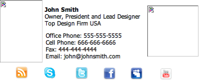
 Photo is Courtesy of FincelDesign.com
- Things you should always include: Your Name, Title, Phone Number, Website, Blog and any applicable social media.
- Include no more than seven lines, however most industries can stick to four.
- To save space, simply hyperlink your title to the "About Me" page on your website.
- Avoid including multiple phone numbers and email addresses, pick your contact preference and stick to it.
- Skip your mailing address or fax number - most of your contacts don't need this information.
- Don't include a legal disclaimer unless your industry requires it - they rarely hold any actual legal authority anyway.
- Never include mention of awards your company has received or advertisements. If they're communicating with you via email, they are already experiencing your business first hand!
3. Consider Compatibility
 Photo is Courtesy of SitePoint.com
- Keep your lines under 72 to words to avoid text wrapping.
- Many of your contacts may read your emails on a smart phone, which means your email signature should be narrow to accommodate a smaller screen.
- Always use full URLs in hyperlinks, because some smart phone platforms require this for the hyperlink to work. For example, instead of "yourwebsite.com" make sure your email signature reads "www.yourwebsite.com" so that they aren't redirected to an error screen.
- Use point size (pt) instead of pixel size (px) when setting your fonts - this is the most reliable way to ensure consistency on every email platform.
- Test your email signature with as many different email platforms as you can to experience how each interprets the signature you have created.
4. Adapt to the Situation
 Photo is Courtesy of WiseStamp
- Consider creating more than one email signature - a long one for initial emails, and a shorter one for replies.
- Have different email signatures for different kinds of clients - which customers call you? Highlight your phone number for them. Which customers read your blog or follow you on twitter? Make sure to showcase your social media platforms for these.
- Make sure that every employee in your company has a similar email signature - but don't be afraid to change their signature based on what role they play.
5. Don't Commit a Faux Pas!
 Email signatures should never rival the length of War and Peace.
- Never include your alma mater or affiliation to any organization outside of your business.
- Don't even think about adding inspirational quotes or slogans, they always read as bad taste.
- Always remove the "sent from a smartphone," message that most phones automatically attach to emails.
- Why would you include your email as part of your contact information?
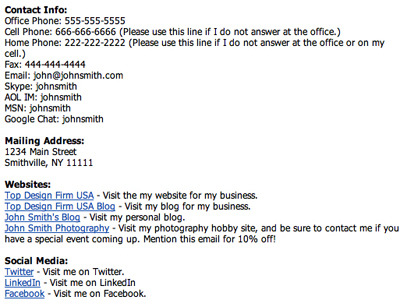
- There is such a thing as too much information. Just look at this example.
Final Thoughts
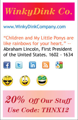
 I hope that coupon is good for more inspirational quotes!
It's easy to get caught up with email signatures. You want to include all the information about your business, but there's such a thing as coming on too strong. When it doubt, go sleek and minimal. The last thing you want to become is an example of a bad email signature on someone's blog (wink, wink)! If you still aren't sure what constitutes a bad signature, check out this hilarious example from Hollister Creative.
